The Application Electric Avenue
This is the result of project 1 (Electric Avenue) of CS424, Visualization and Visual Analytics, with professor Andrew Johnson @ UIC. The assignment was specific on what to do, but left ample movement for creativity on the student part on how to implement, both technically and graphically, the aplication. For more information on the course and the requirements for this assignment, visit the course webpage at http://www.evl.uic.edu/aej/424/.
What can you do with it?A lot! You have access to 6 different data sets, in addition to population information, for every country on earth. In particular, you can visualize:
All this for every year since 1980, up to 2009. For more information on the data and where it comes from, you can visit the data sources page on this website. See the video on the right for an overview of the application, don't forget to set it to 1080p or 720p to make out some details! |
|
How to use it
The interface is straightforward, and it goes from left to right:
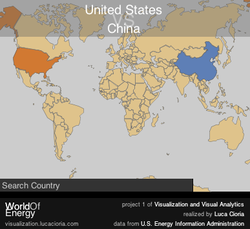
- start by selecting a country from the map, simply click on it.
- you can add another country, and if it's too small to find it there's always the search box!
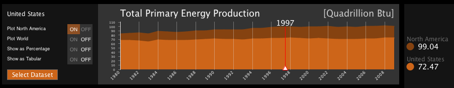
- plots have been generated, and not it's time to play with the data. Focus on the two control panel at the middle, they let you control how data is displayed so as to achieve the desired visualization.
- need some details? The panel on the right is there just for that, touch the plot where you want and it'll show you the exact values being displayed. Also don't forget that you can always display the data in tabular form by selecting Show as Tabular from the control panel.
- with so much data there are lots of things to discover.. if you want you can start with the History panel on the right (click the History button). Select an event and it will guide you through the data to find out more!
